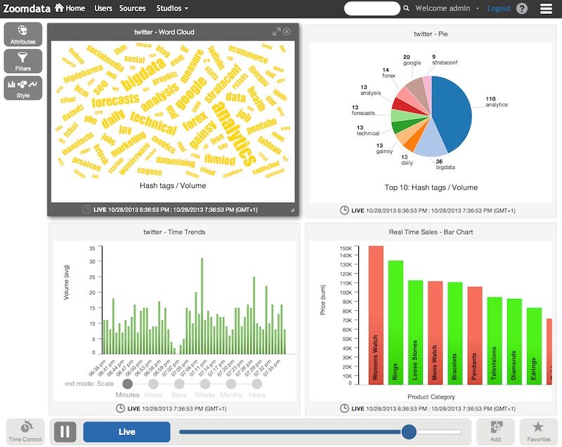
This weekend I took a few minutes to test Zoomdata.
And when I say minutes, I literally mean minutes. These guys have done an amazing job to provide a quick mobile-ready demo that you can download as a VM, or as I did, install from an RPM package in a fresh Linux system.
After the install, I added a twitter data source and created the dashboard that you see above, linking it with the built-in demo sales data. With a little more work, you could build a sentiment analysis vs. sales dashboard in under an hour.
I know, I know. I used a pie chart. Don’t use pie charts!
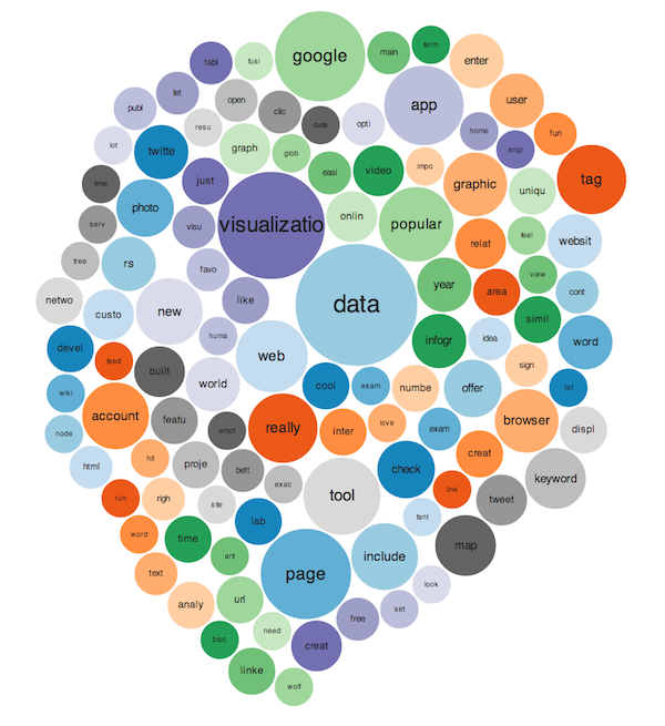
Besides the built-in chart types, Zoomdata includes a “visualization studio“, in which you can import and use another JavaScript library –say, D3js– to create sexier charts. After a few tweaks, I managed to feed my twitter datasource into this bubble chart:
The product uses mongoDB in the back-end and –if I understood correctly– the Zoomdata server periodically stores snapshots of your data sources, painlessly building a sort-of-data-warehouse on the fly. This makes it ideal for building dashboards for trends and historical analyses. All the charts have sliders at the bottom which allow you to go back in time and in some cases aggregate monthly or yearly data. You can see a sample of this behavior at the demo site.
Zoomdata comes with connectors to Cloudera Impala, JSON, CSV, Google Docs, Twitter and good-ol’ SQL databases. All with the promise of “no ETL”, which I don’t actually believe it’s completely true –I can think about one or two cases at work in which I would really, really, need to merge two datasources with ETL– but given that I was able to create a dashboard from different data sources without any kind of pain, I bet that in many cases you could do the same without a single transformation.
If you work in BI, I encourage you to download one of their pre-packaged VMs and give it a whirl.

