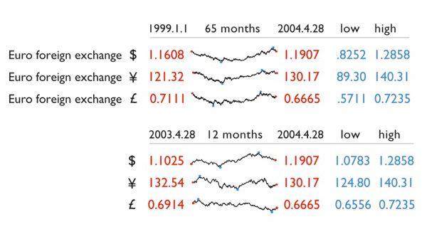
We have seen a lot of sparklines over the last few years. They’re one of the most used high-density charts out there and, if applied properly, they can be a killer feature of any dashboard or report.
The sheer amount of information that can be condensed into sparklines makes them a viable resource to provide a quick at-a-glance story of the evolution of a measurement.The best are the ones which provide additional context, like the normal range, filled with gray in the following charts:
But it wasn’t until I read Beautiful Evidence by sparklines inventor Edward Tufte, that I discovered that these charts were originally designed to be inserted within a text. Becoming datawords, a beautiful term:
If they’re not abused, datawords can be extremely helpful to illustrate points made in the text.
This reminded me of the explorable explanations and reactive documents by Bret Victor. A very clever way of inserting what-if explorations within a text. Test it below by clicking and dragging over the number of cookies:
I think datawords and explorable explanations (explorable datawords?) go together quite nicely. Don’t you?
Resources:
Beautiful Evidence also provides some tips on the correct usage of sparklines. Some of those examples can be found in this page.
Some tips samples on how to create and use sparklines in Excel. More samples here.
Tangle, a javascript framework for creating reactive documents.
jQuery plugin to create sparklines

