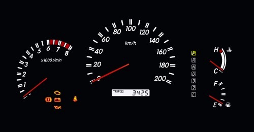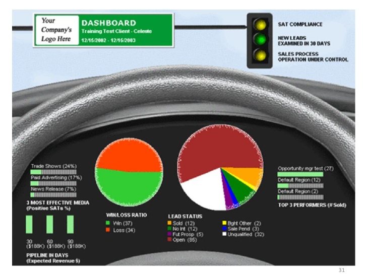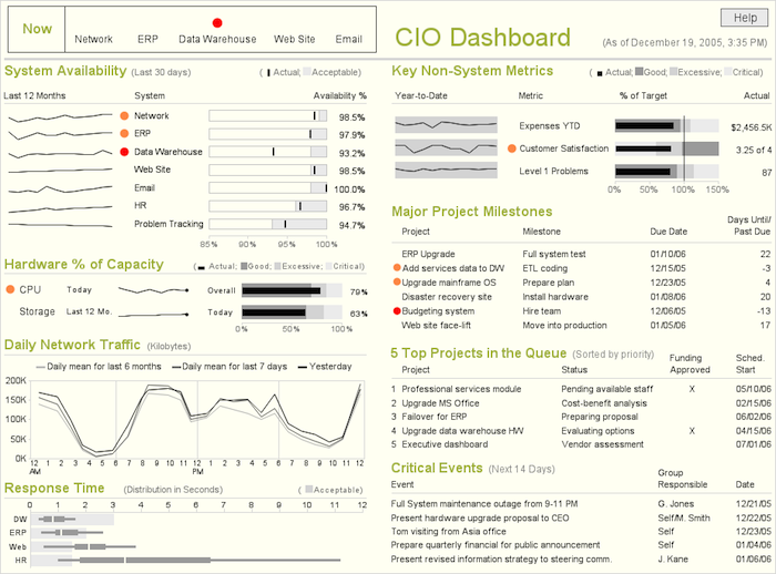
Consider the dashboard of a car: in it, the driver can see the most important data: speed, RPM, mileage, etc. The dashboard displays decision-making information, in a graphical manner, in a single place.
The information dashboards should comply with the same requirements:

Although not necessarily copying the model of a car! This is a mistake. There are better ways to graphically display information.

So, we take a few charts, some tables and we throw them all together in one screen, right?
Uh… nope.
What makes a good dashboard?
- It contains the requested information (obvious? Not always!)
- It has readable text with high contrast (black over white, or some other light shading).
- It highlights the key information.
- Charts are easy to find.
- The problems are marked with icons or in bold letters.
- The important information is generally at the upper left or lower right side.
- It has no more than 5 or 6 data containers.
- It displays useful data to make decisions.
- Comparisons against goals, previously set standards or historical data.
- It doesn’t require vertical or horizontal scrolling. All the information is shown in the same screen.
- If you have a lot of information, you can use tabs.
- If you must, use multiple screens. But remember: the key is to keep all the data related to each other in the same screen.
- Its graphics have a high data/ink ratio without chartjunk.
- It displays the right charts according to the type of data.
- What seems interactive, is interactive. The charts offer details and drill-down when you click on them.
But I think the most important thing is that the dashboard tells a story, or helps you tell a story and, above all else, is esthetically simple. No color degradations or images with shading or use of 3D. Imagine for a second that your car displayed your speed with a 3D chart, would you be able to read it so easily? Would you be able to make right decisions? I don’t think so. Have that in mind when designing a dashboard.

Inspiration
At Excelcharts you can get various dashboard examples made in excel. If you need a little more spiritual aid, I recommend Information Dashboard Design, de Stephen Few. A short and easy to read book; ruthless when it comes to tearing down old notions and clear when teaching the principles of good design for dashboards and reports in general.
Although it has some things specific to their product, the Tableau Visual Guidebook is an excellent guide on the basics of producing a good data visualization. The last pages contain a great checklist that you should complete before deploying your visualization.