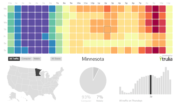
We’re often tempted to include some kind of accessorizing effect in our charts without knowing that deep down we’re making them impossible to interpret and thus ruining their purpose. A typical case is the 3D pie chart.
Many people, including executives, have a certain likeness for 3D charts. Somehow they believe that these look “modernâ€. I invite you to take a look at this chart and try to determine which one is the biggest slice:
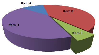
The pie chart is the worst to establish comparisons. Cognitively we’re terrible at estimating areas. If we add to this perspective, we have what Tufte calls Chartjunk:
Too many data presentations, alas, seek to attract and divert attention by means of display apparatus and orna- ment. Chartjunk has come to corrupt all sorts of information exhibits and computer interfaces.
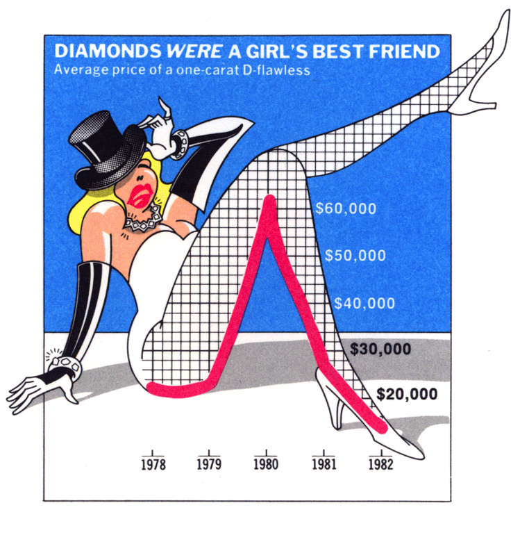
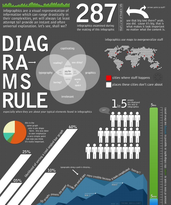
The chart at the beginning of this post is another example of Chartjunk. The designer uses a “clever†design to disguise a chart with only 5 data points. The same thing usually happens with infographics, those increasingly common posters whose main goal is to promote a designer and not present information
In Envisioning Information, Tufte introduces a basic information design principle:
By giving the focus over to data rather than data-containers, these design strategies are transparent and self-effacing in character. Designs so good that they are invisible.
Designs so good that they are invisible. That’s exactly it.
Data/ink
Tufte invented a concept that I really like: the “data/ink†ratio. The idea is to maximize that number, meaning: to use the same amount of “ink†in order to make a chart comprehensible.
Look at the following set of charts. Doesn’t it seem like the chart on the right says the same thing, but that the information is displayed better?
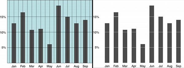
We removed from the left-side chart:
- Color background
- Grid
- Borders
In other cases you can eliminate the zeroes from the numbers on the axes. Instead of placing “15,000.00â€, is way better to put “15mâ€.
Every drop of ink that doesn’t represent data is also chartjunk. And using chartjunk isn’t good:
Lurking behind chartjunk is contempt both for information and for the audience. Chartjunk promoters imagine that numbers and details are boring, dull, and tedious, requiring ornament to enliven. Cosmetic decoration, which frequently distorts the data, will never salvage an underlying lack of content. If the numbers are boring, then you’ve got the wrong numbers. Credibility vanishes in clouds of chartjunk; who would trust a chart that looks like a video game?
Many software vendors try to convince us that we need “pretty†charts, with 3D textures and bright colors. Charts that conceal the data instead of displaying the information; charts that get your attention, but aren’t useful for much else.
Kaiser Fung gathers in his blog junkcharts a notable graphic collection that seem good but that are in fact terrible to fulfill their purpose. This other post from Smashing Magazine is a good example of what not do when creating charts.
So, how do I create good charts?
Seek inspiration. The excelcharts blog offers a gallery of elegant and invisible design examples. Lately, I’ve been experimenting with Tableau Public and D3.js. One of the most positive things of these tools is that they guide you by the hand when it comes to creating visualizations and prevent you from adding junk. Take a look at some of the examples, see some ideas and above all remember that the most important thing is to transmit the information as clearly as possible, and not to present “pretty†charts.
If you need a little more spiritual aid, I recommend Stephen Few’s Information Dashboard Design. A short and easy to read book; ruthless when it comes to tearing down old notions and clear when teaching the principles of good design for dashboards and reports in general.
And if you have no idea where to start and what type of chart you should do, take a look at this post.
