- The client requests a new design
- You discuss what the new design should include.
- Best case scenario: you prepare a specifications document that no one reads.
- You do your best effort
- The client suggests “minor changesâ€.
- You both realize that some contents and key design pieces are missing
- You lose 3 months of your life.
If this has ever happened to you, by now you should know –or not– that creating a skeleton or wireframe is one of the first steps for designing a webpage or app.
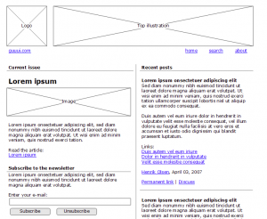
Most wireframes don’t include graphic elements because the goal is to provide the client with an idea of the structure and hierarchy in order to identify the contents (text, data, images) that are missing and the potential problem areas.
Furthermore, a skeleton allows you to identify and mark design “areasâ€. This way, phrases such as “remember to send me the text that goes under the image located between the video and the formâ€, becomes “remember to send me the text that goes on A7â€.
—
Tools for wireframing
I use Omnigraffle for mac along with the excellent Konigi templates. Just to give you an idea of what you can do with both, check out this video:
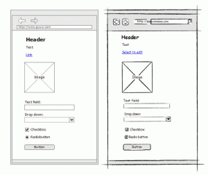
The user-interface expert, Henrik Olsen, has an excellent template for Visio in his site. This template offers the additional benefit of having a sketch mode where elements appear as if drawn by hand.
According to Aaron Travis, another user-interface expert, offering computer-generated sketches, decreases the barriers for client participation while “softening†the criticism and decreasing the tension. By offering a hand-drawn diagram, all involved parties can understand that it’s a work in progress and that this is the time to suggest changes.

And this leads me to the tool that I’ve been trying for the last few days (and partly the reason for this post): Balsamiq Mockups: a web wireframing app that works on PC, Mac and Linux.
Mockups is integrated with Dropbox so you can share progress with your clients while reviewing minor changes and during long distance meetings.
Also, take a look at their website, the small and reliable company image is very well done and the slogan is one of the most honest slogans I’ve read in a long time:
Balsamiq is a small group of passionate
individuals who believe work should be fun
and that life’s too short for bad software.
(None of that “we’re a leading company in blah blah blah”)
—
However, the wireframe is not everything you need to be happy
Every project needs some sort of guide. When you analyze the skeleton with a client, it’s important that you agree on not discussing the graphic elements, instead that you’ll talk about the structure, hierarchy and requirements.
Susan Snipes makes an excellent summary of what each group (clients, designers and developers) should look for in a skeleton. For instance, if it’s a website, you should encourage the client to ask the following questions:
- What content is missing? What content doesn’t need to be on the page?
- Are the most important features clearly visible and easy to spot on the page? (Tip: On first glance of a page, what is the first thing you see?)
- Do you know what you can do on specific pages?
- Do you know where you are on the site? Can you figure out how to get to another page of your choice?
- Is it clear how to do your key actions (such as contact the company, or download a product manual)?
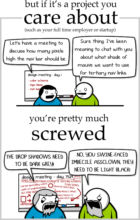
Once you’ve all agreed with the structure, you can discuss the graphic part, making sure you don’t reach the extremes of this The Oatmeal strip:
