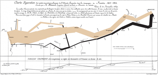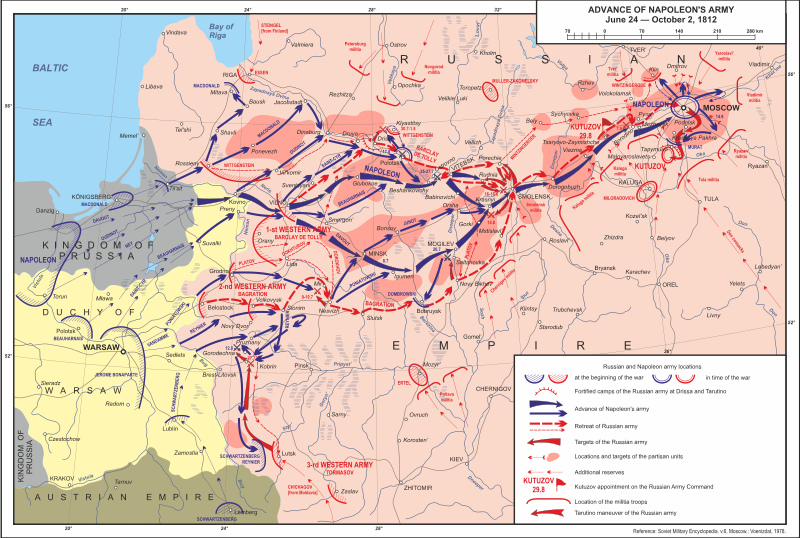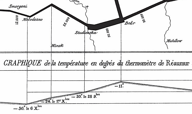
In The Visual Display of Quantitative Information, Tufte highlights Minard’s famous graphic where the story of the lives (and deaths) of over 400,000 soldiers is told during Napoleon’s invasion of Russia. Tufte declares it the first infographic that combines geographical elements with time and temperature variables. But the most relevant aspect of the chart is that it tells a story in a very effective manner. For instance, we can compare this chart with the one that is found in the campaign’s Wikipedia article:

This graphic has a lot details, including information regarding the mobilizations and the commanders. However, it fails to highlight something crucial: the harshness of the russian winter.

Minard’s visualization fluently tells the drama of a failed campaign, the inhumane temperatures, the embarrassing recall of a decimated army. It’s so clear, that it provides information with just a glance, and yet it invites to a scrutiny that is rewarded with the understanding of a story.
And at the end, this is what we should do with graphics: no just provide information but awaken an interest, tell a story.