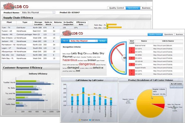
Business Objects, SAP’s BI platform, is notoriously bad for data visualization. Somehow, it empowers the developers to make all the wrong decisions at the same time and create really ugly and unusable “dashboards”.
Lately, I’ve seen my share of ugly bobip visualizations, like the one above. Which would seem ok but it commits the greatest of sins: unnecessary embellishment.
To create better Business Objects visualizations you should try to avoid “non data ink”, like:
- Unnecessary big numbers (100,000,000 could be abbreviated to 100M)
- Axis borders.
- Colored or gradient backgrounds.
Also, you could re-work your charts to remove:
- Data point markers.
- Double vertical axis.
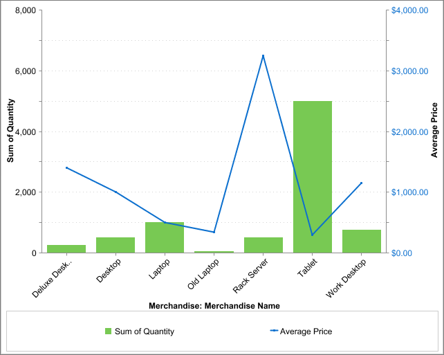
Also, surprisingly –or not– Business Objects lets you mix bars and lines to confuse the reader:

Lines in a chart are supposed to express continuity, cause and effect.
In this case, the use of lines confuses the reader. There’s no logic in stating that a measurement in the leftmost products influences the ones at the right.
Unless you have a time measurement in the horizontal axis, you should avoid using lines mixed with bars.
All this omissions and mistakes defies the purpose of the chart, which is to give a quick assessment of the situation. A professional product like Business Objects shouldn’t let you make those mistakes. But unfortunately it does and that’s why your charts suck.
Noah Iliinsky addresses some of this charting “sins” in his famous talk “Data Viz: You’re Doin’ it Wrong”
I don’t doubt for a second that SAP’s BI Platform must be great for building data warehouses, but it’s notoriously poor as a tool for visualizing data. You would be better served by using bobip in the back-end and disguising it with Processing, D3js or some other library to better show of the fruits of your hard work. In every Business Intelligence endeavor, charts are the visible face of the project. If your charts suck, your project sucks. Is as easy as that.
As a developer, it also helps to learn some design elements and even do some reading on the subject. Remember: your charts and dashboard should be compelling enough to inspire and motivate the users to dive into the data.