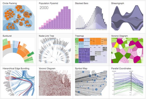
There’s a chart for every situation. Each type of information that you have and each analysis that you want to make can be benefited or harmed by the chart you choose.
The idea of displaying data graphically is to help the other person understand what you mean to say. Do you think sales are at risk? Do we have a problem in one of the regions? Help me see that information as clearly as you do.
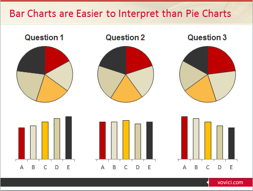
Pie charts are used to display the parts of a whole and the bar charts are used for comparisons. Many people confuse them or feel tempted to display results with a pie chart. However humans are terrible at estimating areas. This slide from vovici clearly tells the difference:
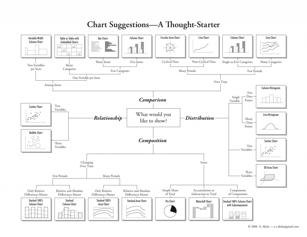
But there are customers that request a specific chart “just becauseâ€. To these persons I usually show this diagram from Andrew Abela that helps you choose the right chart, according to the type of data that you have (click to enlarge):
Once you have the best type of chart, remember that every presentation needs to tell a story. What matters the most is that they understand and remember what you meant to say. Therefore, your chart must help you narrate, help you stay focused on that story and prevent the data from getting lost in a poorly chosen chart.

In this other post I wrote a bit about how to prevent your data from getting lost within those fancy effects that, even though we like them, aren’t useful to make decisions.


